website redesign
Inside the New DurgeshGupta.com Website Redesign
Explore how DurgeshGupta.com was redesigned with Next.js 16, Tailwind CSS 4, stronger founder positioning, case studies, and technical SEO.
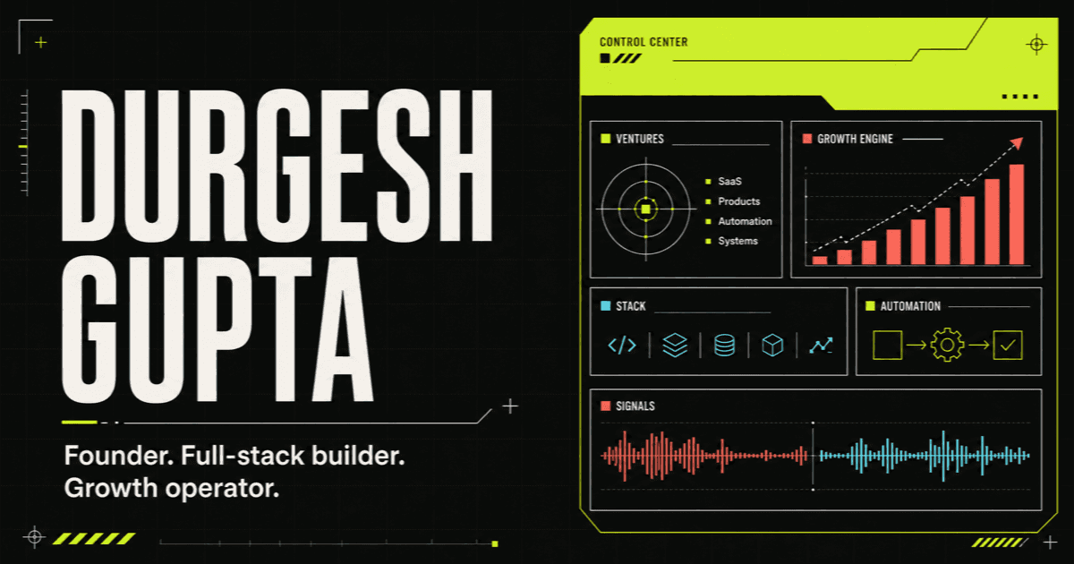
A personal website should evolve with the person behind it. My previous website did a useful job of publishing articles and presenting my development background, but it no longer represented the full scope of my work.
I am not only a developer. I am the founder of WebAnaya, a designer, marketer, digital transformation partner, AI and automation practitioner, and the operator behind multiple online tools and SaaS products.
The new DurgeshGupta.com website redesign was created to communicate that reality clearly. It combines stronger founder positioning, real proof of work, a more distinctive visual system, and a modern technical foundation built with Next.js 16, React 19, and Tailwind CSS 4.
This article explains why the redesign was necessary, how the new experience was structured, and what founders and technical professionals can learn from the process.
Why I redesigned DurgeshGupta.com
The old website was primarily structured as a developer blog. That made sense at an earlier stage of my career, but it created a growing gap between my website and my actual professional identity.
Over the years, my work has expanded across several connected areas:
- Full-stack web application development
- Product and user experience design
- Digital marketing and search engine optimization
- Business process transformation
- AI agents and workflow automation
- SaaS product development
- Cloud infrastructure and managed digital operations
The redesign needed to bring these disciplines together without turning the homepage into a long list of services. The central idea became simple: present one accountable operator who can think strategically and also ship the work.
That positioning is more accurate, more useful to potential clients, and more differentiated than a generic freelance developer portfolio.
A founder-led personal brand strategy
The first major decision was to make the person and point of view unmistakable.
The homepage now opens with my name, followed by a direct positioning statement: founder, full-stack builder, and growth operator. The supporting copy explains the value more clearly: I design the business system, build the product, automate the operation, and engineer the growth engine around it.
This approach matters because visitors should not have to assemble a founder's story from disconnected service pages. Strong personal branding gives them an immediate answer to three questions:
- Who is this person?
- What kind of problems can he solve?
- Why should I trust him with an ambitious project?
The new structure answers those questions progressively through positioning, verified scale, capabilities, selected work, products, and insights.
Designing a visual identity that feels like an operator
The visual direction combines editorial typography with the language of a modern product control system.
Instead of relying on conventional portfolio templates, the redesign uses:
- Large, confident typography
- Crisp borders and structured grids
- An electric lime signature color
- Coral and cyan signal accents
- Compact operational labels
- Product-dashboard-inspired information layouts
- Restrained motion and hover feedback
The result is intentionally different from a traditional agency website. It feels technical without looking like a developer tool, expressive without becoming decorative, and professional without becoming corporate.
The visual system also works in both light and dark modes. Light mode uses an off-white editorial surface, while dark mode shifts the experience into a high-contrast command-center aesthetic. The user preference is stored locally, and the initial mode respects the operating system setting.
Replacing claims with proof
One of the most important changes was moving proof closer to the top of the experience.
The homepage now surfaces the delivery record associated with my work through WebAnaya:
- 15+ years of experience
- 500+ projects delivered
- 150+ clients served
- 98% client satisfaction
Numbers create context, but case studies create understanding. The redesign therefore includes selected product and platform work rather than relying only on capability descriptions.
ZeroComp
ZeroComp is a legal-technology and compliance platform built with a headless Next.js architecture and a custom CRM. It brings more than 300 business registration, tax, compliance, and legal services into one connected experience.
SocietyNx
SocietyNx is an AI-enabled society management SaaS platform. It combines member management, billing, maintenance, communication, document workflows, analytics, and intelligent assistance in one system.
TourPackages91
TourPackages91 is a headless travel lead-generation platform built to connect high-intent travellers with relevant packages and agencies. It demonstrates how experience design, content architecture, and modern frontend engineering can work together around a commercial objective.
These examples make the positioning tangible. Visitors can see the type of systems I work on, the industries involved, and how strategy translates into a real interface and operating model.
Showing the product portfolio
Running products changes the way a person approaches client work. It creates direct exposure to acquisition, activation, reliability, support, retention, pricing, and prioritization.
The redesigned website now gives my product portfolio a dedicated presence, including:
This is not simply a list of side projects. It demonstrates an operating mindset. Building and running products keeps strategy grounded in customer behaviour and business reality.
Upgrading to Next.js 16 and React 19
The website was migrated from an older Next.js 13 setup to Next.js 16.2, with React 19.2 underneath it.
The upgrade provides a stronger long-term foundation for the site:
- Modern App Router architecture
- Static generation for articles and tag pages
- Improved development and production tooling
- Better image optimization
- Cleaner metadata generation
- Fast route-level rendering
- A more maintainable component structure
The site currently generates the homepage, About page, Contact page, blog archive, individual articles, topic pages, sitemap, robots file, and web app manifest through the Next.js application.
Migrating from Tailwind CSS 3 to Tailwind CSS 4
The styling layer was upgraded to Tailwind CSS 4.3 and moved to its CSS-first configuration model.
The design tokens now live close to the global styles, including:
- Brand colors
- Font variables
- Responsive breakpoints
- Dark-mode variants
- Motion preferences
- Shared interface surfaces
This makes the visual system easier to understand and maintain. It also keeps the design language consistent across the homepage, About page, Contact experience, blog archive, article pages, and footer.
Rebuilding the blog content pipeline
The previous website used Contentlayer to process MDX articles. Contentlayer's Next.js integration was tied to older framework versions and was no longer a dependable fit for Next.js 16.
Rather than forcing an unsupported dependency into the new stack, I replaced it with a focused local content pipeline.
The new system:
- Reads article front matter from the content directory
- Generates article URLs from folder names
- Calculates reading time
- Builds a table of contents from headings
- Creates tag archives
- Produces static article pages
- Generates article metadata and structured data
Existing article URLs were preserved, which is essential during a website redesign. Changing a visual system should not throw away years of search equity or break links that readers already use.
Technical SEO improvements in the redesign
Search engine optimization was treated as part of the architecture rather than a plugin added at the end.
The redesigned site includes:
- Descriptive page titles and meta descriptions
- Canonical URLs for articles
- Open Graph and social-sharing metadata
- A dedicated branded social preview image
- Article structured data using Schema.org
- Automatically generated XML sitemap entries
- Robots directives
- Static, crawlable article pages
- Semantic heading structures
- Internal links between content and commercial pages
- Preserved blog and tag URLs
The new content hierarchy also improves topical clarity. The homepage establishes the primary entities and services, case studies provide evidence, product links demonstrate operating experience, and the blog builds depth around relevant subjects.
Accessibility and responsive design decisions
A visually ambitious website still needs to work for real people across devices and input methods.
The redesign includes accessible navigation labels, keyboard-friendly links and controls, clear color contrast, responsive typography, stable media proportions, and touch-friendly interactive areas.
Motion is used to support hierarchy rather than distract from it. Scroll reveals, progress feedback, and hover interactions are restrained, and the experience respects the user's reduced-motion preference.
The layout was designed for mobile screens first, then expanded into denser editorial and dashboard compositions for larger displays. Text, controls, project imagery, and navigation remain readable without overlapping or causing layout shifts.
What I learned from redesigning my own website
Redesigning your own website is difficult because the business, audience, content, and identity are all personal. It is easy to keep adding capabilities and lose the central story.
The most useful lessons from this redesign were:
Positioning should lead the interface
Visual design becomes much easier when the primary message is clear. The interface should amplify the positioning, not try to compensate for vague positioning.
Proof should appear before a long service explanation
Visitors trust visible work, relevant outcomes, and operating experience. A strong case study often communicates more than several paragraphs of capability copy.
A personal website should show a point of view
Professional does not have to mean generic. A founder website should reveal how the person thinks, what they value, and how they approach difficult work.
Technology should support the story
Next.js 16 and Tailwind CSS 4 make the site modern and maintainable, but the framework is not the value proposition. The technology matters because it helps the experience remain fast, accessible, searchable, and easy to evolve.
Frequently asked questions
What technology is the new DurgeshGupta.com built with?
The redesigned website uses Next.js 16.2, React 19.2, Tailwind CSS 4.3, the Next.js App Router, static article generation, and a custom local MDX content pipeline.
Does the website support dark mode?
Yes. The site supports both light and dark themes, respects the visitor's system preference, and remembers a manually selected theme.
Were the existing blog URLs preserved?
Yes. Existing article and tag routes were retained during the migration to protect inbound links, reader bookmarks, and established search visibility.
Why does the homepage include products and case studies?
They provide concrete evidence of my experience across SaaS, product engineering, digital transformation, AI-enabled workflows, and growth-focused web platforms.
Can I work with Durgesh Gupta or WebAnaya on a digital project?
Yes. If you are planning a product, business transformation initiative, AI automation workflow, SaaS platform, or growth-focused digital experience, you can start a conversation through the contact page.
A website designed to keep evolving
This redesign is not a final monument. It is a stronger operating surface for the next stage of my work.
The new DurgeshGupta.com presents a clearer founder identity, makes real work easier to inspect, gives the product portfolio proper visibility, and creates a modern publishing foundation for future insights.
Explore the new homepage, learn more about my approach, browse the latest technology and business insights, or book a conversation about what you are building next.